Why?

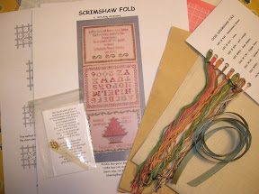
I went to my Orange Coast Sampler Guild meeting tonight. I wasn't going to do the project. We didn't get to see a picture ahead of time and I didn't think I would want to do it. I thought that it might be a canvas piece as the designer does do a lot of canvas work, nothing wrong with that, but I thought I'd pass on this one. Once I saw it, I wished I had signed up. Lucky me, they had extras on hand, so I went for it. $45 bucks is pretty "cheap" when it comes to any project for this guild.
A local designer, Margaret Bendig, designed Scrimshaw Fold, A Stitching Accessory, especially for our guild. It's the 15th anniversary of the guild, so she included the guild logo, a basket of oranges, and it has a significant 15 oranges in it. The colors of silks and dupioni are really pretty. She commented on how she is not an "orange person". Neither am I, but I do like the pallet she came up with, and the orange part is really a soft clove almost salmon color which is quite tolerable. Anyway, that's just for the logo part. The project was designed to hold all the various pieces of the logoed scrimshaw made available to guild members. A new piece is added each year. I only have one piece of the collection and I really don't intend on purchasing the whole set. Scrimshaw is quite expensive and I don't think ours is especially pretty, just cool if you're a guild member. Anyway, it's nicely constructed beautiful fold with silk pockets and such and I thought I should have it. Margaret likes to encourage stitcher's to make modifications and gives other options to the design and finishing, and I intend on doing just that. On with the lecture, or rather, instruction of the piece. This guild has done some fairly formidable projects a la CA Wells, Merry Cox, etc. Since Margaret is also a member of the guild, perhaps the fact that she knows what they've tackled before had something to do with the speed. I'll tell you what, you gotta have it going on when it comes to these "classes". I find most classes are like that. Fortunately, it does look like her instructions are pretty good. I'll let you know if/when I ever get to the finishing part. I'd love to start it right away but my plate is too full right now. I think when I complete this project I should treat myself to another piece of the scrimshaw set. It's by Marcy Pumphret and she actually uses old piano keys.
Oh, about that diagram stuff. LOL.. I was embarrassed at myself when I finally figured out at home tonight that the diagram I was looking at for the Two-Sided Italian Cross Stitch was actually the diagram for Reversible Cross Stitch. In my defense, I was not the only person confused by the placing of the title of the stitch. Besides that, I've never seen the Reversible Cross Stitch diagramed this way, so it was new to me, too. LOL. It's cool. Now, I know a new way to do reversible cross stitch.
And... to me,
the logical place for a title/description to go is above it, not below it, since we read from left to right, top to bottom.

6 comments:
I love this project - the colors are mouth-watering! I would put the text at the bottom. Because I usually do things backwards... ;)
I love that project too! Those oranges are a delicious color! :)
I agree with Barbara...I'd but the text at the bottom too...Barbara says she does thinks backwards...well my DH says I do them *bass ackwards*...he thinks he's so cute...LOL!
I'm not really an orange person but those shades are very pretty!!!!
What a pretty project! Glad there was a kit for you.
I would have been confused too :-).
Where I'd put the titles for the charts would completely depend on the overall document. I've worked on a lot of proposals for large companies, and in those proposals the titles for tables were over the tables, and the titles for images of any kind were *under* the images. But, if it's a single page with just a few drawings on it, I'd be sorely tempted to put the titles at the top. LOL
Post a Comment